← Backstage
The complete visual checklist for an album release
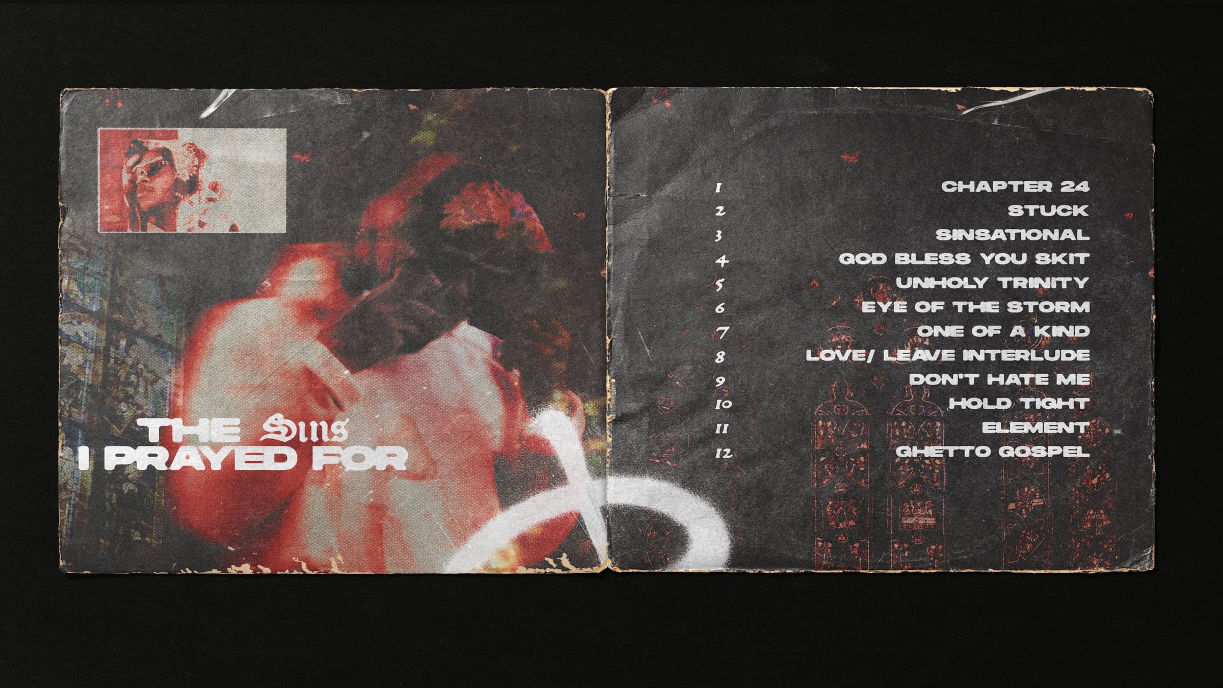
Every release the studio has packaged follows the same painful pattern when planning starts late: the cover is beautiful, and everything else gets designed in a panic the week of the drop. The fix is knowing the full surface area in advance. This is the checklist · what a release actually touches, in the order to produce it.
Phase 1 · the system (8-12 weeks out)
- Front cover · the anchor. Designed to hold at thumbnail size and at full bleed.
- Back cover & tracklist · same system, print-ready.
- Color & type rules · the three decisions everything else inherits. For The Sins I Prayed For it was a three-color system: red for tension, brown to ground it, grey to breathe.
- Single covers · variants of the system, not new designs.
Phase 2 · the physical (6-8 weeks out)
- Vinyl & packaging · labels, sleeve, inserts at print resolution with bleed. The longest lead time in the whole release · pressing plants do not do rush.
- Merch · tees, stickers, packaging. The cover system applied at body scale.
Phase 3 · the campaign (2-4 weeks out)
- DSP assets · Spotify and Apple Music banners, playlist pitch art.
- Spotify Canvas · the 8-second loop on every track page, built from the cover system.
- Out Now videos · the announcement cuts for feeds and stories.
- Social kit · presave, countdown, drop-day, and week-after posts, sized per platform.
- EPK refresh · the press kit with the new era's photos and assets.
On drop day, every surface a listener lands on should read as one record.
The test
Put the vinyl, a tee, the Spotify banner, and an Instagram story side by side. If a stranger can tell they belong to the same record without reading a word, the system works. If not, the release reads as five small moments instead of one big one.
Planning a release and want the whole package designed as one system?
Get a quote →