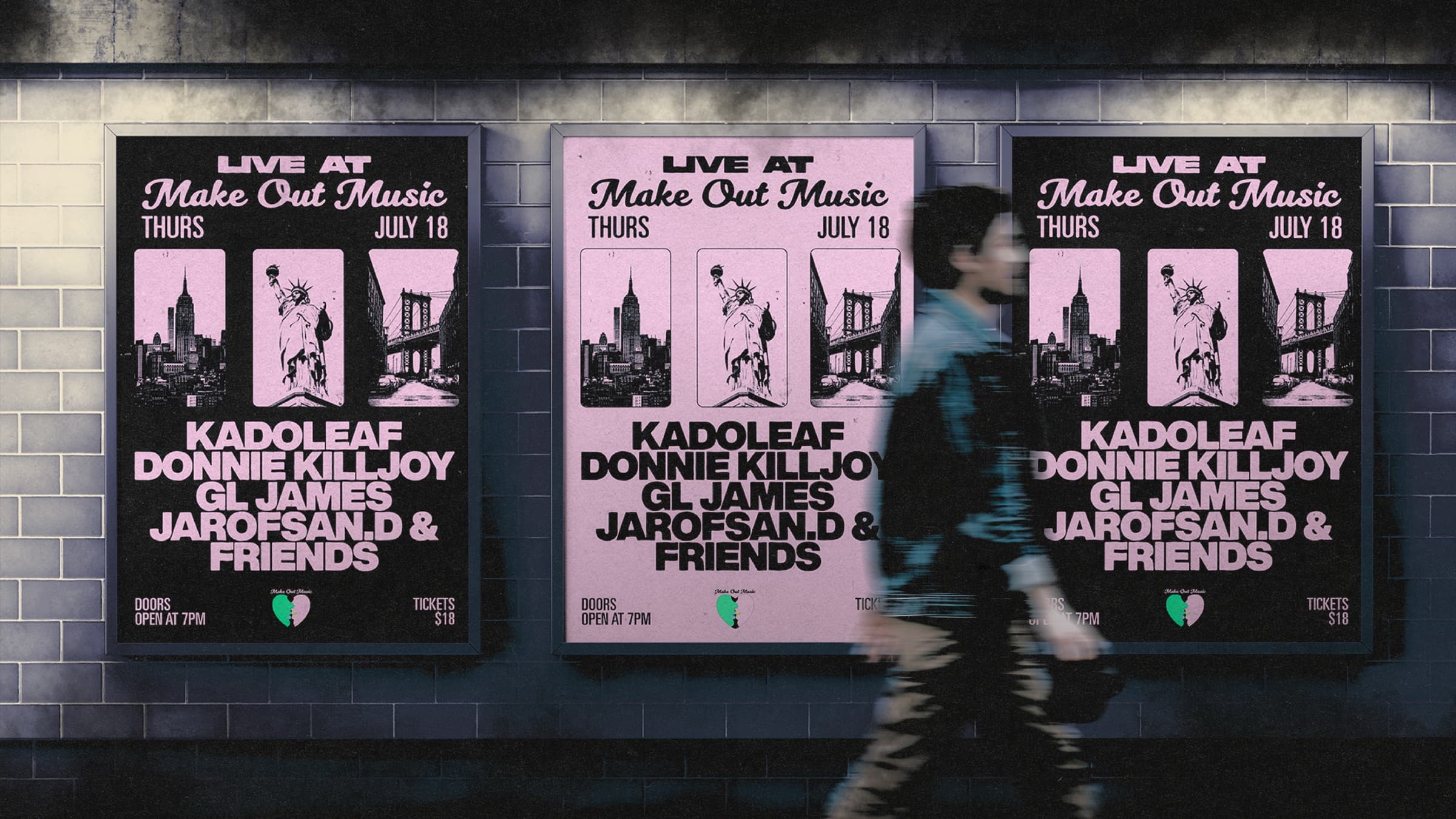
A record, a venue, a clothing brand, a restaurant · the image has to match the experience. Brand strategy at HBLR defines that world: the references, the type, the color, and the rules that keep everything consistent as the project grows.
We built a full festival identity this way · one system that ran from the wheatpaste poster on the street to the wristband at the door to the tee the morning after. Same hand-set type, same silhouettes, same pink-on-black. That is what a system buys you: cohesion that compounds with every touchpoint.
The deliverable is not a mood board. It is a working kit · logo and wordmark, type and color system, brand book · that you and anyone you hire after us can actually use.
- Visual direction · references, mood, intent, locked before production
- Naming & manifesto · the words that frame the world
- Logo & wordmark · primary, secondary, and usage rules
- Type & color system · chosen for stage, screen, print and storefront
- Brand book & press kit · the kit your next designer will thank you for
Do you do brand identity outside music?
Yes. The studio comes from music, but the method works just as well for a clothing brand, a venue, a restaurant or a shop: one identity that holds together from the sign on the street to the post on the feed.
What does the process look like?
Brief, then direction, then delivery. We define the visual world together · references, mood, intent · before a single file opens. Concepts follow in days. Source files are yours, always.
Can you refresh an existing identity instead of starting from zero?
Yes. Often the name and the history are right and the system around them is what is missing. We audit what exists, keep what is earned, and rebuild the rest.