003 · Festival Visual Identity · '24
Make OutMusic Festival
Brand StrategyDesign & Artwork
The festival is known to feature underground and DIY bands that speak to a younger audience. The approach needed to reflect that — in addition to an edgy and energetic feeling.
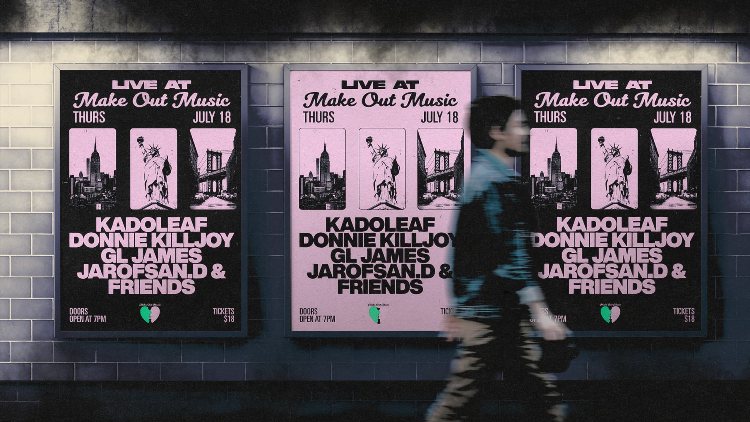
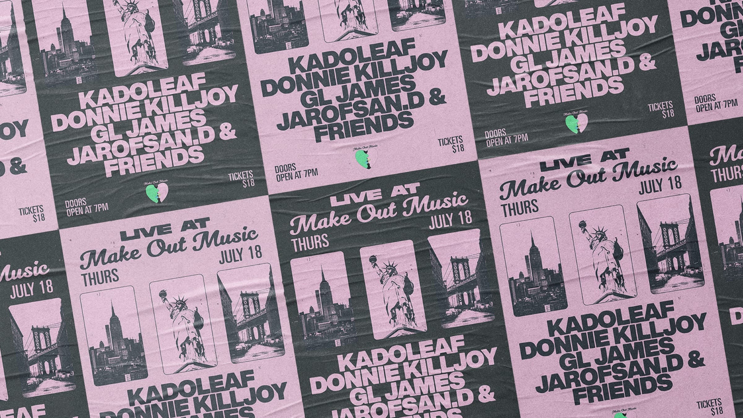
A festival lives in public space before it lives anywhere else. The poster does more than print — it's the festival's first claim on the street, the visual that builds buzz weeks before the door opens, the image that ends up in every camera roll. For an underground bill with a small budget and a street-first audience, the wheatpaste IS the marketing.
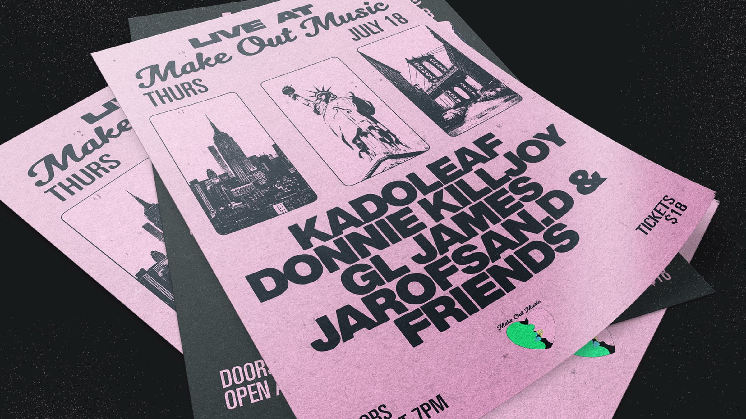
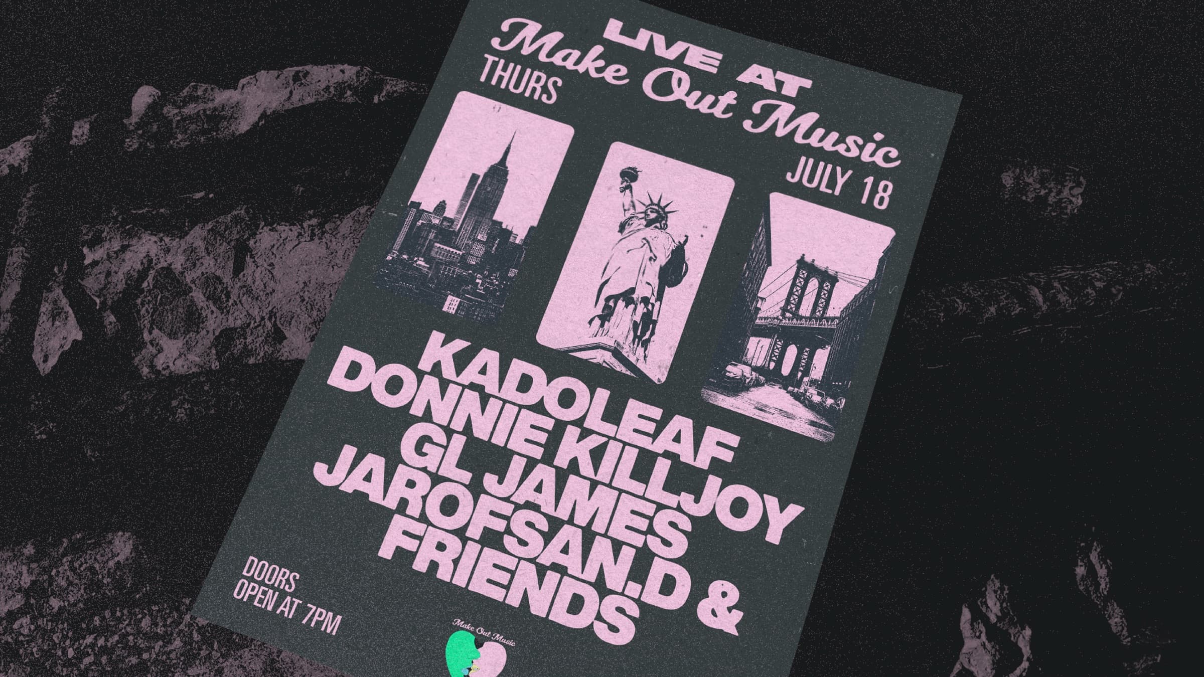
Pink on black, xerox grain, three NYC silhouettes. The artwork had to read at a glance from across a block and still hold its detail when someone stopped to scan the line-up.
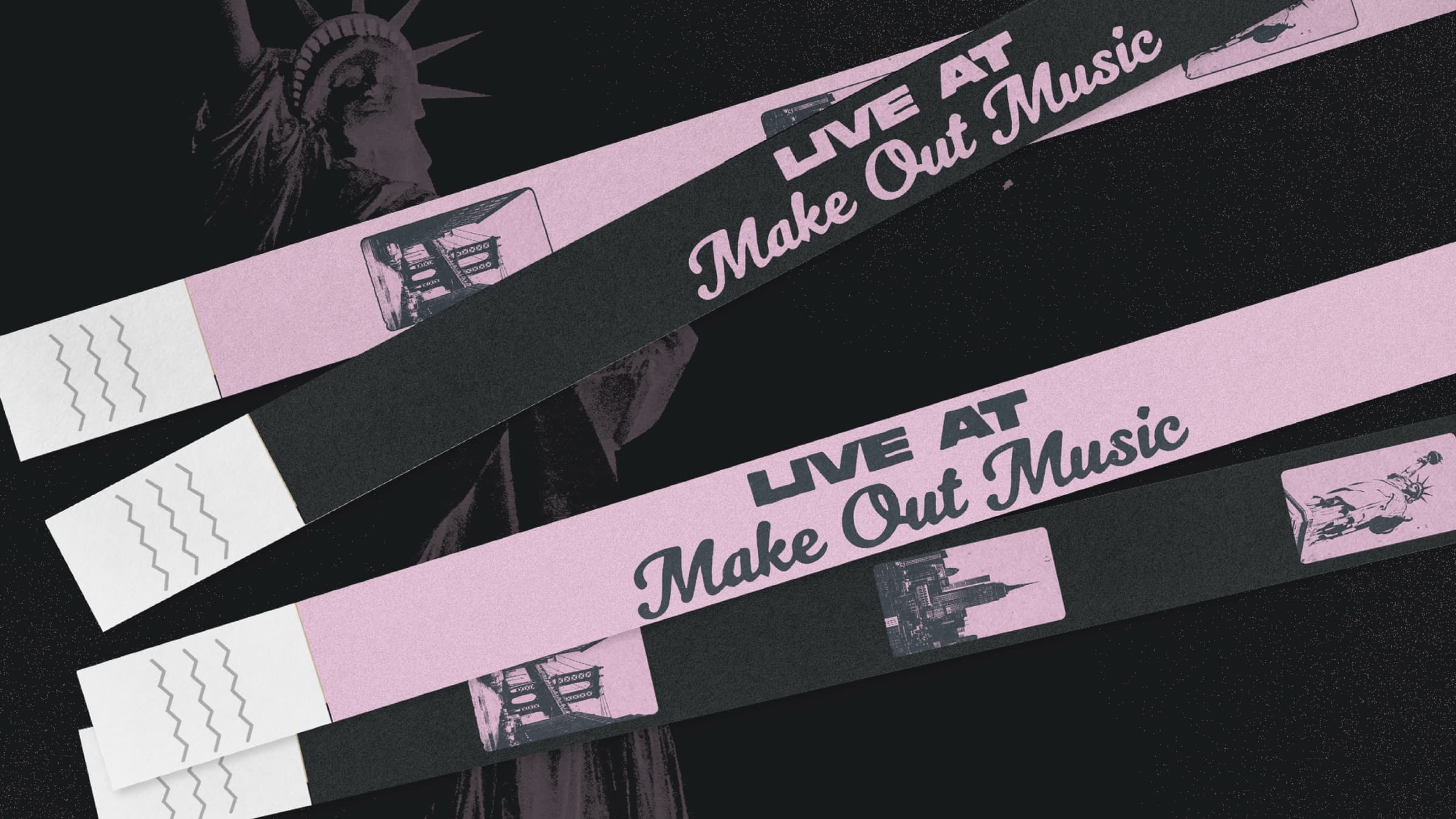
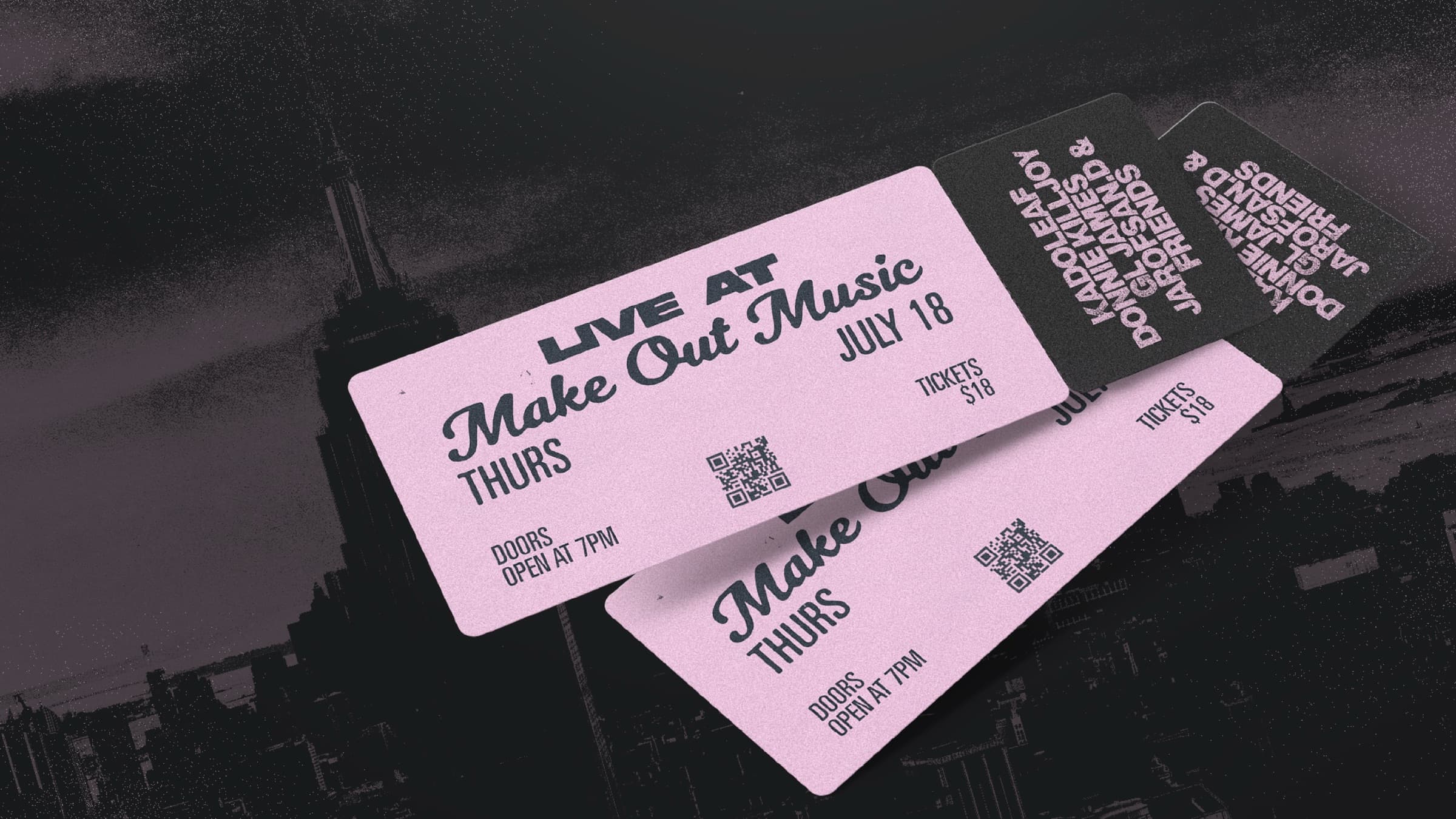
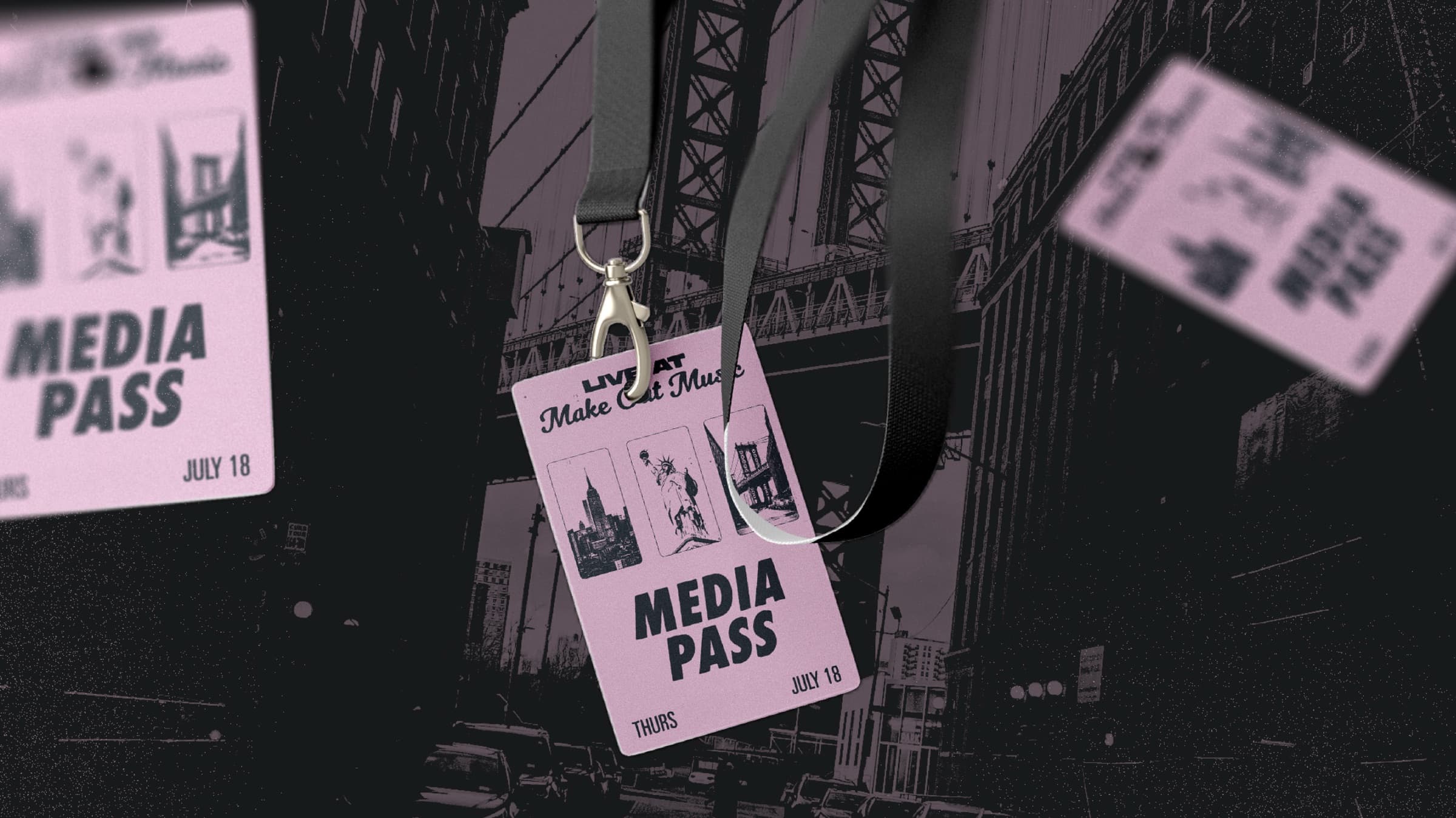
A festival lives in moments — the line at the door, the wristband snap, the photo with the ticket stub. Each touchpoint is a chance for the brand to imprint. Done right, the wristband becomes a story post, the ticket becomes a keepsake on the fridge, the media pass gets framed by a photographer who shot the night.
After finalizing the poster design, we delivered additional wristband and ticket designs, as well as promotional assets for use both in promoting the festival and during the event itself.
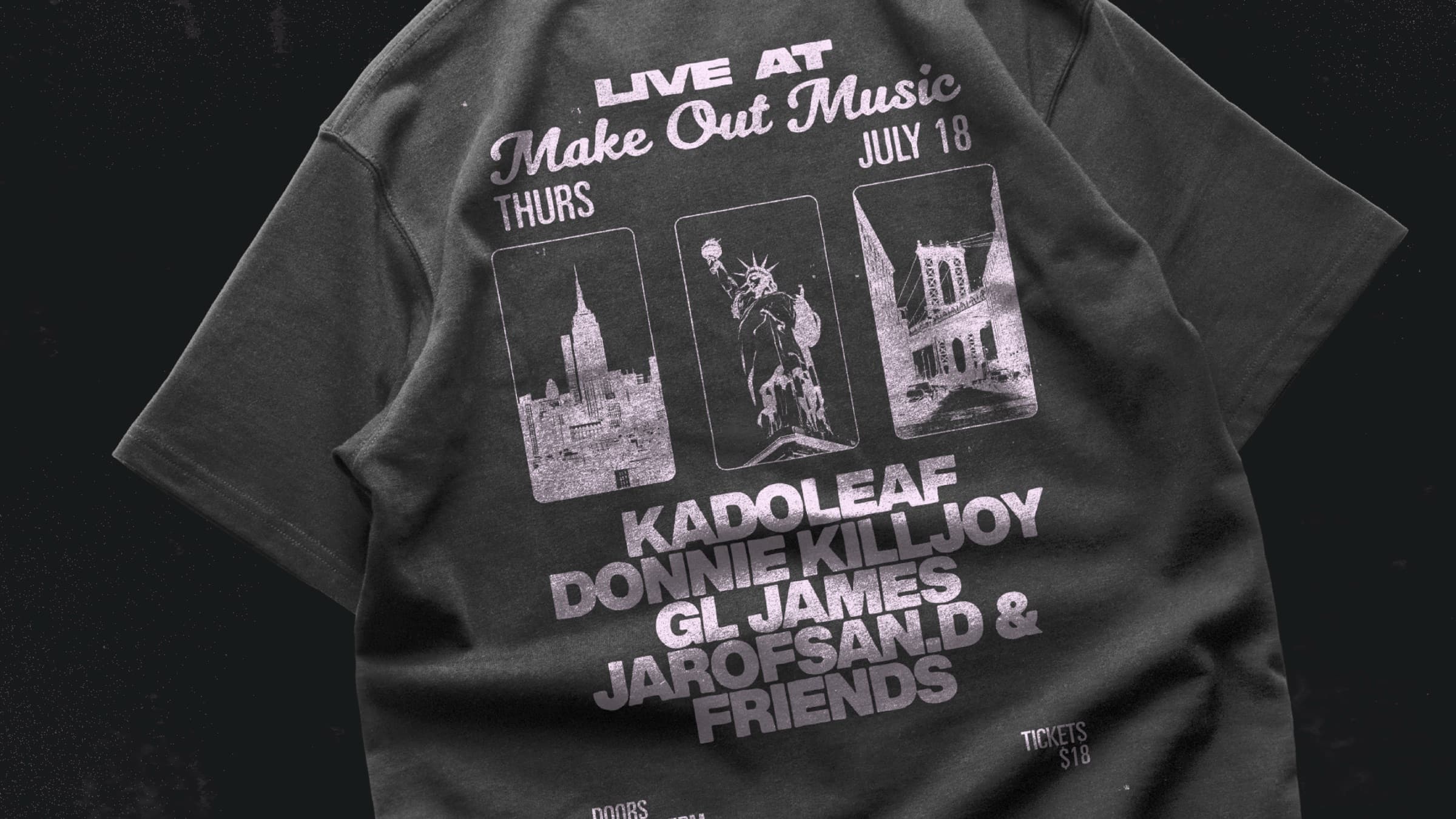
The night ends but the tee goes on. Merch is the festival's afterlife — it walks down streets weeks later, it shows up at the next show, it becomes the visual proof that says "I was there." For an underground bill, a tee that survives in someone's closet is a free billboard for the next edition. The poster system already worked at body scale — the tee inherits the artwork directly.
One identity ran across every touchpoint of the night. The poster on the brick wall, the wristband at the door, the ticket in the pocket, the tee the morning after — same hand-set type, same NYC silhouettes, same pink-on-black. The kind of cohesion that turns a one-night underground bill into something a photographer wants to shoot and an attendee wants to remember.